Widget Panel
This is a window for laying node parameters back out in the shape, color and size you want. Rather than arranging UI that the node provides, it is built the other way round: the widget you place points at a node parameter, so the same parameter can be a fader or a button, and the ON/OFF colors are decided per widget. You can open as many panels as you like.
Opening it
Create → WidgetPanel in the menu bar.
An empty panel shows the watermark “Right-click to add a widget”. Double-click the title bar to give the panel a name (the name is saved too).
Adding widgets
Right-click empty space in the panel to bring up the widget palette. Hover the mouse over a category (Value / Choice / Display / Layout) and its list opens on the right. The widget you choose is placed where you right-clicked (it snaps to the grid, and if it would stick out it is nudged to a position that fits inside the panel).
The lower part of the same menu has these two items.
| Item | What it does |
|---|---|
| Browse all… | Shows every widget in a dialog. From From Node... you can walk node → parameter and create an already-bound widget directly |
| Freeze Layout | Freezes the layout and puts the panel into the performing state (described below) |
A freshly placed widget shows “Unbound”. It is perfectly fine to lay out the shapes first and assign parameters later.
Moving, resizing and deleting
While the panel is not frozen, each widget shows an editing frame.
- Drag the bar at the top → move
- Drag the square at the bottom right → resize
- Right-click a widget → menu (Assign / Appearance… / Duplicate / Delete / Freeze Layout)
Moving and resizing both snap to a 20px grid.
Stacking order
The widget you touch rises to the front (the same whether editing or Frozen). The stacking order is saved together with the project, so it comes back in the same front-to-back arrangement the next time you open it. When you want to touch a widget that is underneath another one, there is no need to move anything — just touch the one on top once to send it elsewhere.
Widget types
The palette lists the following 19 types. The parentheses hold the parameter types you can plug in (shown in small text on the right of the menu).
Value (make a value)
| Widget | Type | What it does |
|---|---|---|
| Fader | Float / Int | Vertical or horizontal switches automatically by the widget’s aspect ratio (vertical when height ≧ width). The value jumps to where you press |
| Knob | Float / Int | Vertical drag for relative adjustment (up increases). It does not jump to where you press |
| Number | Float / Int | Drag horizontally to scrub; release without moving to type a value directly. With no range there is no upper limit |
| XY Pad | Float / Int ×2 | The main binding is the X axis, Assign Y… is the Y axis. Up is the Max side |
| Crossfader | Float / Int ×2 | Writes opposite values to Left and Right according to the position |
| Toggle | Bool / Float / Int / Color / Options | Switches every time you press it |
| Button | Trigger / Bool / Float / Int / Color / Options | Fires / sets a value when pressed |
| Color Picker | Color | An inline picker you touch directly, with nothing to open |
Choice (options)
| Widget | Type | What it does |
|---|---|---|
| Dropdown | Options | Press it and the list opens. The options are fetched the moment it opens, so it naturally follows layers being added or removed and NDI sources appearing |
| Button Grid | Options | One button per option. The button currently selected lights up in the ON color |
Display (view only)
| Widget | Type | What it does |
|---|---|---|
| Label | Text | Just displays text (always display only) |
| Text Input | Text | Confirms on Enter or when it loses focus, Esc reverts it. Plugged into a read-only parameter it only displays |
| Meter | Float / Int | A level meter. The peak is held for 0.8 seconds before it falls |
| Preview | Texture | A video monitor that updates at about 30fps |
| Drop Area | Text | A surface that writes the path when you drop a file onto it. Accepts files from Finder / Explorer, and thumbnails from the Contents Browser too (if you drop several, only the first one is used). Plug it into PathToLayerMedia’s File Path and it becomes a surface where “the dropped material goes straight into the layer” |
Drop Area can be layered on top of Preview. The background and border colors are the Off color from Appearance (the On color while hovered), and this type alone allows alpha in its colors, so making it fully transparent and stacking it over Preview gives you a “throw material at the Display” experience.
Show Hinthides the guidance text and file name. Dropping the same file again writes it in again. A Drop Area set to Display Only does not accept drops (they fall through to the layer row underneath, or to another Drop Area). Files dropped onto a Drop Area are not imported into the Contents Browser’s library.
Layout (decoration, holds no binding)
| Widget | What it does |
|---|---|
| Header | A section heading. The text color is the On color from Appearance |
| Divider | A separator line. Vertical or horizontal switches automatically by aspect ratio |
| Frame | A frame for grouping. The inside is pass-through, so widgets laid on top of the frame can be touched normally |
Node View
Embeds a node’s control UI into the panel as it is. It is the escape hatch for when you want complex UI that widgets do not express well (a step sequencer, for instance) close at hand.
There is only one Node View per node. Adding, duplicating and pasting are all rejected if a view of the same node already exists (including one on another panel). Because the node itself owns the UI, Node View has no
Appearance….
Assigning a parameter (Assign)
The main procedure is these three steps.
- Right-click empty space in the panel and place the widget in the shape you want
- Right-click that widget and choose
Assign… - Click the actual parameter highlighted in pink in the Node Editor
While assigning, Assigning ...: click a highlighted parameter (Esc / right-click to cancel) appears at the top of the screen.
You can cancel with Esc or a right-click.
What gets highlighted is only the parameters whose type fits the shape you placed. For parameters with no port row (dropdowns on the node, for example) the node itself is highlighted, and if that node has several candidates a menu of parameter names appears after you click.
For an unbound widget, clicking the “Not assigned” text in the editing bar starts the same assignment.
Widgets with two axes
XY Pad and Crossfader get two items in the right-click menu.
| Widget | Menu |
|---|---|
| XY Pad | Assign X… / Assign Y… |
| Crossfader | Assign Left… / Assign Right… |
Both work with only one side assigned (the XY Pad becomes an X-only pad, the Crossfader becomes a fader that drives Left in reverse).
The shape you place changes to match the type you plug into
What Toggle and Button become is decided by “the type they are plugged into”.
| Shape placed | Trigger | Bool | Float / Int | Color | Options |
|---|---|---|---|---|---|
| Toggle | — | Toggle | Value toggle (On value ⇄ Off value) | Color toggle (On color ⇄ Off color) | Button Grid |
| Button | Button | Toggle | Value button (sets the On value when pressed) | Color button (sets the On color when pressed) | Button Grid |
Plugging a Button into a Bool turns Momentary on by default. “True only while held” is the intuitive behavior for a button. Plugged in from a Toggle it stays an alternating toggle as before. Either can be changed at any time in
Appearance….
Value buttons and value toggles light up when the current value matches the configured value (so you can see across the surface which value is selected). For a color button, the button’s background color is the color it sends, and a match is shown with a white border.
Checking and changing a binding
| Menu | What it does |
|---|---|
| Reveal Source | Moves the Node Editor to that node and selects it, then highlights the target parameter for about 1.2 seconds |
| Clear Assignment | Removes the assignment (the layout and appearance settings remain) |
| Appearance… → Binding | Bind... / Change... pick from a dialog, Unbind removes it |
The bar at the top of a widget being edited shows node name / parameter name. Hover the mouse over it to see the internal address as well.
Changing appearance and behavior (Appearance…)
Right-click a widget → Appearance…. Changes take effect immediately.
| Setting | Contents |
|---|---|
| Label | The display name. Leave it empty and it falls back to the parameter name |
| Colors | Two colors, On and Off. Switch tabs to edit each |
| Font Size | 0–48. 0 is automatic |
| Display Only | Makes it display only (it does not accept the pointer even while frozen) |
| Momentary | On only while held (on the XY Pad this is “Spring Return” — it returns to the center when you let go) |
| Values | The On Value / Off Value of value buttons and value toggles |
| Range | Min/Max override for Fader / Knob / Meter / Number |
| Visible Options | Narrows down the options shown in Dropdown / Button Grid |
| Show Hint | Shows the Drop Area’s guidance text and file name. Turn it OFF and it becomes just a surface |
Leave Range empty and the parameter’s own default range is used. For parameters that have no default range it is treated as 0–1 (unlimited for Number). Min > Max simply gives you an inverted fader (it is not an error; it works as a fader with the ends swapped).
Only some widgets show Momentary. Value buttons always show it, Toggle shows it only when it is plugged into a Bool, and the XY Pad shows it as Spring Return. On any other widget the item does not appear at all.
Visible Options cannot be turned all the way off. By design the last one cannot be removed. Conversely, turning them all on normalizes to “no filtering”, so when layers and the like are added later, the new options are shown automatically.
Freeze (freeze the layout and perform)
A panel has two states. You switch between them with Freeze Layout / Unfreeze Layout
in the right-click menu of empty space or of a widget.
| Unfrozen (editing) | Frozen (performing) | |
|---|---|---|
| Grid | Shown | Hidden |
| Move bar, resize handle, binding name | Shown | Hidden |
| Adding, duplicating, deleting | Possible | Not possible (the menu is grayed out) |
| Operating faders and buttons | Not possible | Possible |
Freeze when you want to touch values. To prevent mistakes while you are placing things, operating widget values is disabled entirely while unfrozen. When it “will not move even though you are touching it”, you have usually forgotten to Freeze.
While frozen, the whole panel scales with the window size. It scales while keeping the aspect ratio, based on the panel size at the moment it entered Freeze (widen the window during a show and the widgets under your hands get bigger too). Unfreezing always returns to 1:1, and the coordinates themselves do not change.
Assign… and Appearance… work even while frozen. Only layout operations are frozen.
Keyboard controls
These only work while the pointer is over the panel and the panel is not frozen.
| Key | What it does |
|---|---|
Ctrl/Cmd + C / V | Copies / pastes the selected widget (you can paste into another panel too) |
Ctrl/Cmd + D | Duplicate |
Delete | Delete |
Ctrl/Cmd + Z | Undo |
Ctrl/Cmd + Shift + Z / Ctrl/Cmd + Y | Redo |
Undo is independent per panel, and the history holds up to 50 steps. It is a separate thing from the Node Editor’s undo, and it covers only layout, binding and appearance changes. Value changes such as moving a fader are live operations, so they are not pushed onto the history.
Copying and duplicating do not carry the MIDI mapping over. One knob hitting two widgets is usually an accident, so it is deliberately left empty.
Assigning MIDI
The widget itself becomes the MIDI receiver. The same widget you touch with the mouse can be driven from MIDI as well.
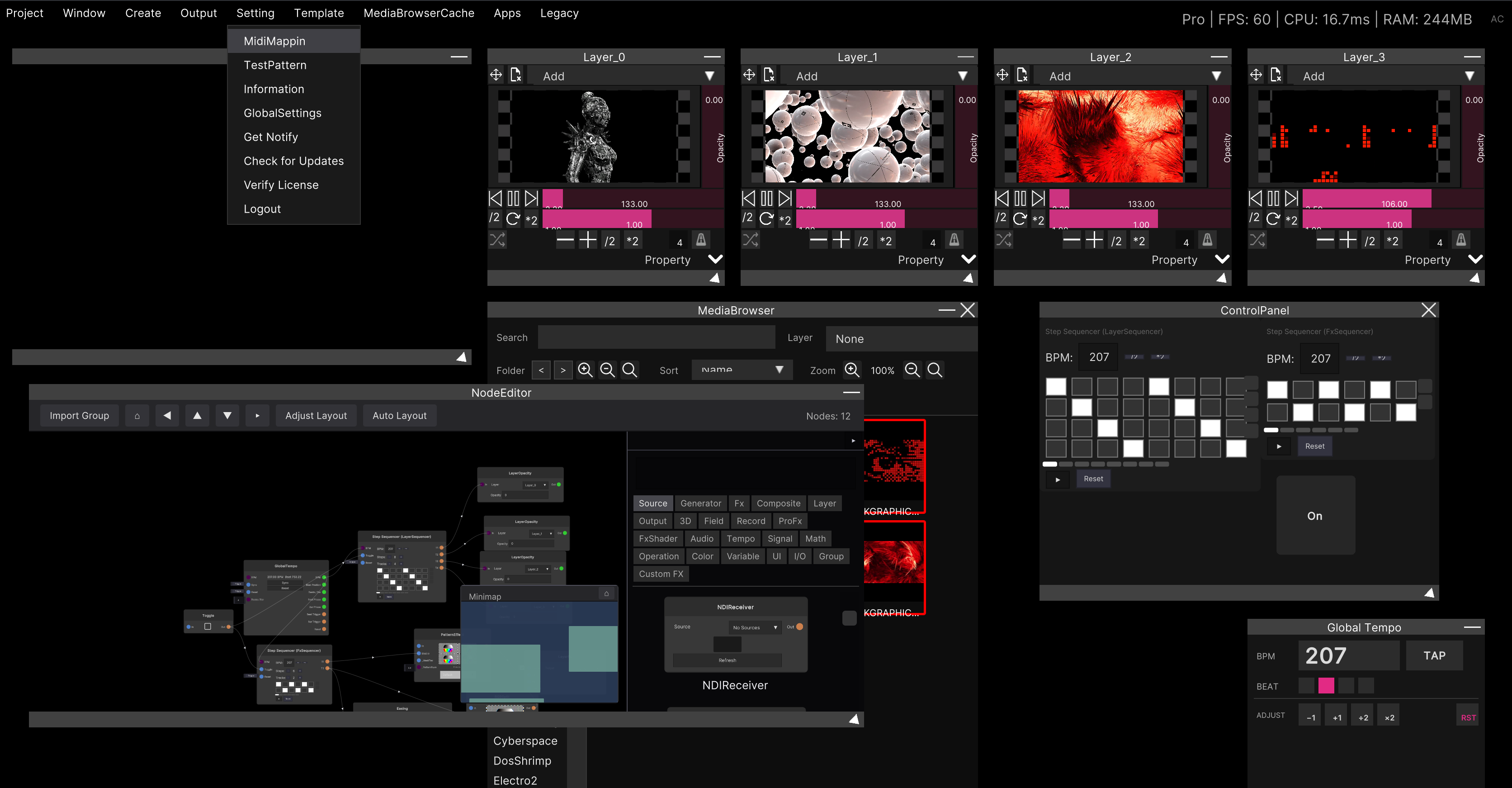
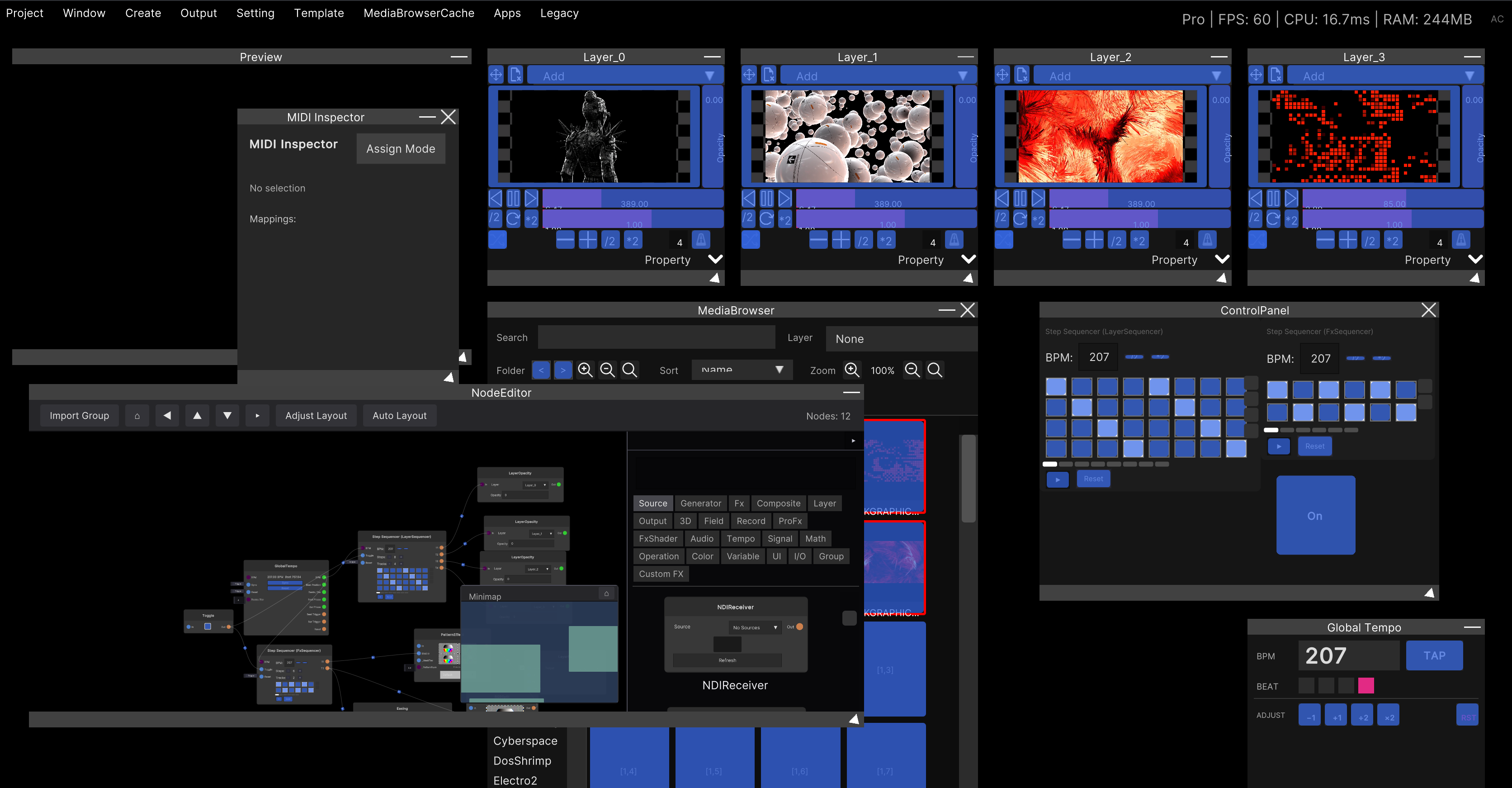
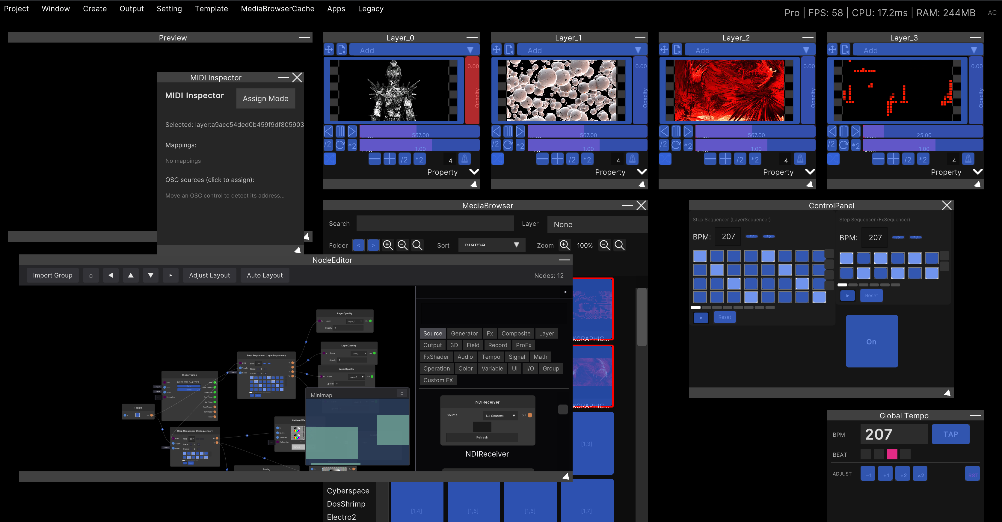
- Enter assign mode with Setting → MidiMapping in the menu bar (the MIDI Inspector window opens)
- The widgets that can be assigned turn blue
- Click a widget and it turns red (selected)
- Move a MIDI controller in that state and it is assigned to that widget
Each widget interprets MIDI as follows.
| Widget | How MIDI acts |
|---|---|
| Fader / Knob | Maps 0–1 onto the range |
| Crossfader | 0–1 is the position directly |
| Number | Works only when Min/Max are fixed (it has no effect on fields with no upper limit) |
| Toggle | Normally toggles the moment it is pressed; with Momentary it is ON only while held |
| Button (Trigger) | Fires the moment it is pressed |
| Value button / value toggle | Sets / toggles the moment it is pressed |
| Dropdown | Advances to the next option each time it is pressed (wraps back to the first at the end) |
Button Grid is assigned one button at a time, not as a whole widget. In assign mode each button gets its own target, so you can map each key of a pad to each option.
The following widgets cannot be assigned to MIDI. Color Picker / XY Pad (one knob cannot be split across two axes) / Label, Meter, Preview, Text Input, Drop Area (display- and drop-only kinds) / Header, Divider, Frame (decoration) / Node View (the node’s own UI holds the controls) / unbound and Missing widgets. For unbound ones the saved mapping itself is not lost, and it comes back when you bind them again.
How it is saved
Widget Panels are saved together with the project (.synapse). There is no file for a panel on its own.
What gets saved:
- The window’s position, size and title
- Whether it is frozen (and the reference size for the frozen scaling)
- The type, placement and size of each widget
- The binding target (which parameter on which node)
- The appearance (label, On/Off colors, font size) and behavior (display only, Momentary, On/Off values, range override, option filtering, Show Hint)
- The stacking order of the widgets
- The MIDI mappings assigned to the widgets
Deleting the node a widget is bound to does not delete the widget. It degrades to a “Missing” display, and the layout, the binding information and the appearance settings all remain. The same holds when you open a different project, or at a stage where you have not created the nodes yet. Building the screen first is a way of working that does not break.
Things worth knowing from the implementation
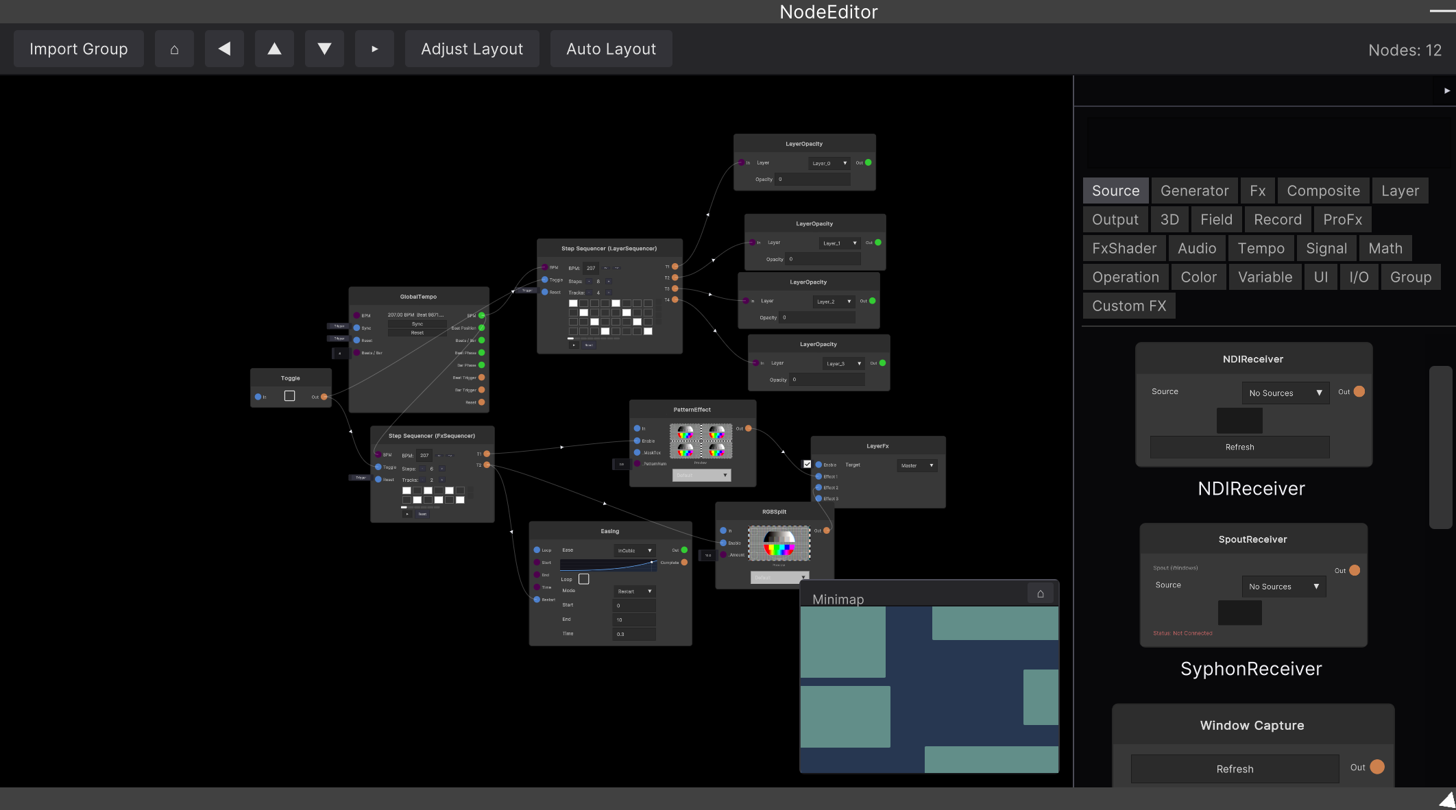
Only the nodes actually shown in the Node Editor become Assign candidates. Parameters on nodes that are not on screen are not highlighted. If not a single compatible parameter is found, the assignment ends without anything happening (it only logs a warning). In that case, choose from the
Appearance… → Binding → Bind...dialog.
The Binding dialog (
Bind..., andFrom Node...inBrowse all…) lists only the nodes of the active project. Resolving saved bindings, on the other hand, spans every project, so a widget bound to a node inside a group stays alive even after you leave the group.
Widgets placed inside a Frame are not “children of the Frame”. The decoration is only a visual frame; move the Frame and the widgets inside do not come along.
A panel that references not a single live node (empty, unbound only, or decoration only) is saved along with whichever project you save. This behavior exists so that a half-built layout is never silently thrown away.
Preview keeps refreshing at about 30fps. It redraws at a fixed interval rather than waiting for the value to change, so lining up a lot of them costs accordingly.
Related
- MIDI mapping — the shared way assign mode is used
- Node Editor — where you build the nodes that hold the parameters you bind to